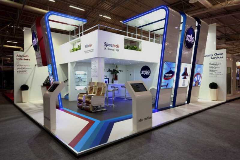
Using an engaging, uniquely designed exhibition stand is among the most effective ways to achieve success at an exhibition.
The best stands will not only create a strong impression but will also help the business stand out from your competitors. You may have heard before that first impression matters a lot when comes to attracting participants at an exhibition.
As much as your company may have superior products and trained marketing team, poorly designed stands will steer away potential customers from your stand into the hands of your competitors.
Here are some of the strategies to help you come up with eye catchy exhibition stands design that will guarantee you more visitors at your stand and deliver the best results as far as the exhibition is concerned.
Establish the exhibition goals
What do you want to achieve after the exhibition, and what message do you want to communicate with your exhibition booth? These are some of the questions you need to bear in mind during the design process. It will be a loss to you if the exhibition stand does not convey your company's image, mission, and values. You also need to factor in your branding position in your exhibition design. For instance, is your company caring, creative, high-tech or traditional?
Target audience
When coming up with an exhibition stand design, it is important to keep your audience in mind. This will help focus your idea on your clients' wants and needs. After all, there is no need for creating an attractive design that will not be able to attract the people who are likely to purchase your products.
Space maximization
To make use of your space, the exhibition stand should take up the whole space allocated for your company. You also need to ensure that the stand is taller compared to your competitors. Your company logo and signage should be placed at the top of your stand. Also, ensure that there are no physical barriers at the entrance of the booth.
Text
Using texts is a great way to market the business, but when it comes to an exhibition, ensure to have as fewer texts as possible. The texts you use should also be clear and concise for easier understanding by visitors. You obviously do not need a whole sentence when a single word can convey the message.
You also need to consider your text fonts. They should be large enough to be seen from a distance. Using bright colors for your texts can come in handy.
Graphics
Considering that you will be using fewer texts on your stand, use the extra space to come up with more graphics. As the old saying goes, a picture is worth a thousand words, and this applies to your stand design. Use of right images will help you convey the most complex ideas in a simpler way for easier understanding.
Think about the people you want to target at the exhibition and what images will be most appealing to them. Do not forget to use the company logo in your images since this will help confirm your brand identity.
