When building an ecommerce site, one of the most important and enjoyable aspects of its construction is the design.
Hosting plans, payment gateways, and ESSL certificates are vital to the operation of an online store; but as the gatekeeping to your site, if the design is repulsive, then it doesn’t matter how seamless the back-end functions are.
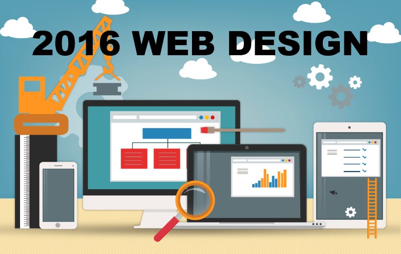
Here then, we’ll have a look at three of the most touted web design tips and trends for 2016.
Responsiveness
One can argue that responsive design has been an important aspect of web building since the advent of smartphones and tablets, only growing in significance as web surfing via handheld devices took over that of laptops and desktop computers. But 2016 will be the first year that will start with Google evaluating the responsiveness of a site when ranking web pages on their SERPs.
So, what exactly is responsiveness? Simply put, responsiveness is how well a site responds to its environment. A site that looks fantastic on a 20-inch screen may not offer a good user experience when viewed on an Android device or iPad. Responsiveness is not merely about rescaling your site, but also about considering how to display side menus (most commonly placed into the now ubiquitous ‘hamburger’ icon of three straight lines) and how to replace features instigated by hovering, which is of course not possible on touch screens.
Video
Our eyes are naturally drawn to movement, therefore incorporating some video into your website’s construction is a powerful way to entertain visitors. Clicking play is an easy way to engage site visitors, as unlike text it requires no effort on their part. Additionally, video is becoming more and more important for SEO. Google recently announced that video was a must-have component for any mobile marketing strategy, saying: “Mobile viewers are in fact more likely to watch, share, and feel connected to ads and branded video.”
Video can be incorporated in various ways, you can try the silent banner exemplified by mattress company evemattress.co.uk (if you are to have auto-play videos, ensure they initially run in silence) and cinemagraphs, a chic blend between photo and video, able to be put together in Photoshop.
Typography
The internet has finally begun to offer more choice in type-face, principally thanks to the initiation of Google Fonts. Gone are the days when web designers were limited to Arial. Now, most of the top Los Angeles web design companies even create their custom fonts that match the website design. Do not underestimate the difference a font can create in the overall impression your site makes on visitors. It will most likely be a subliminal effect, but it is only the more important because of that.
