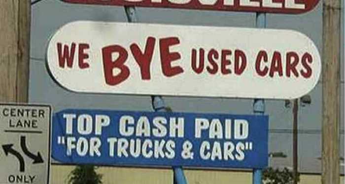
In the sign industry, we tend to see small businesses struggling with how to properly incorporate signage into their retail locations, office buildings and service vehicles. Sometimes it's because signage is an afterthought in an already overwhelming day.
Other times, it's because owners don't fully understand how signage impacts their businesses. Whatever the reason, many small companies make huge mistakes when it comes to implementing their signage.
Here are the top 3 mistakes we see:
Choosing the wrong materials.
Although a sign can be created from almost anything, there are very specific cases where one material is superior to another. The most common mistake that a small business can make when choosing a material is going with the cheapest just because it's well...cheap. The need to save money and cut costs is understandable—nowhere is this more evident that in a small business. But, just because a material is inexpensive, doesn't mean it won't cost you in the long run.
Before purchasing a sign, make sure you identify where the sign will be installed. Will it be exposed to the weather or high traffic areas? How long do you want the sign to last? A great example is foam board. This material is great for temporary point-of-sale signage, window displays or event directional signs. But if you are looking for something permanent, it tends to disappoint. Foam board can be very brittle when it isn't handled properly. How devastating would it be to install a beautifully-designed sign only to have the wind blow it down and it break in half? A better alternative would be to install a solid PVC sign or composite sign, like Alumilite or Dibond. These materials are made for exterior use and will last years, even in poor weather conditions.
Choosing the wrong location.
Unfortunately, we don't get to help many of our customers install their signs, but if you take a quick drive down your local main street, you might notice that some signs could have used a little help when it came to placing them in the proper location.
There is this great little Chinese restaurant very close to my house. It sits between a frontage road and a major highway. I noticed yesterday that their main illuminated sign is not facing either. In fact, it is installed on the front of the building, which can only be seen by drivers heading in one direction. To compensate, the owners placed 6'x3' banners facing the road and the highway. The banner facing the road is fairly easy to see but in between the building and the highway is an empty lot, probably 100 yards across, making the second banner almost impossible to read.
Avoid this dilemma by identifying where your traffic is coming from, what type of sign will be large enough to grab customer's attention and whether your sign should be illuminated or not. In the end, you might end up with a combination of different types of signage, but at least you will know that what you do install will have the greatest impact.
Choosing the wrong design.
We see a lot of great sign designs, but we also see our fair share of bad ones. Having a poorly-designed sign is far and away the biggest mistake we see small businesses make. There are numerous factors that go into whether a sign is designed properly or not, but even the simplest things may have a huge impact on how the sign is perceived by others.
The biggest offenses usually involve trying to cram too much information into a sign, using the wrong color combinations, making bad font choices and providing poor-quality images.
When creating a sign, there is a tendency to want to convey many different messages. Small businesses owners think, "We are having a sale but we are also pet friendly, so maybe I should add a picture of me and my cat to soften it up." Or, "We need our email, phone number, physical address, web address and Twitter handle on our sign." Unfortunately, they are trying to get all this information into a 24" x 18" yard sign that will be installed out near the street where drivers are trying to read it while driving 55 mph. When in doubt, go simple. Focus on one really important objective and do it well.
Also, choose a font or fonts that aren't too scripty or fancy. Choose colors that contrast for text and backgrounds. The best combinations are black on yellow, black on white and yellow on black. Finally, if you are going to use an image or picture in your sign, make sure the resolution is at least 200 dpi. Depending on the size of the sign, your image may need to be 300 dpi, but at 200 dpi, you can pretty much guarantee that the print will be clear. How can you tell what the resolution is? Just right click on the image, select "properties" and click the details tab. Another way to know is where the image originated from. Anything found on the Internet is usually too low a resolution to use when printing a sign. So, please don't copy your Facebook profile image and slap it in your design. I promise, if you do, you won't be happy with the outcome.
So, the next time you create a sign for your business, keeps these common mistakes in mind. If you do it right, signage is a great way to display your company's brand and attract new customers.
